
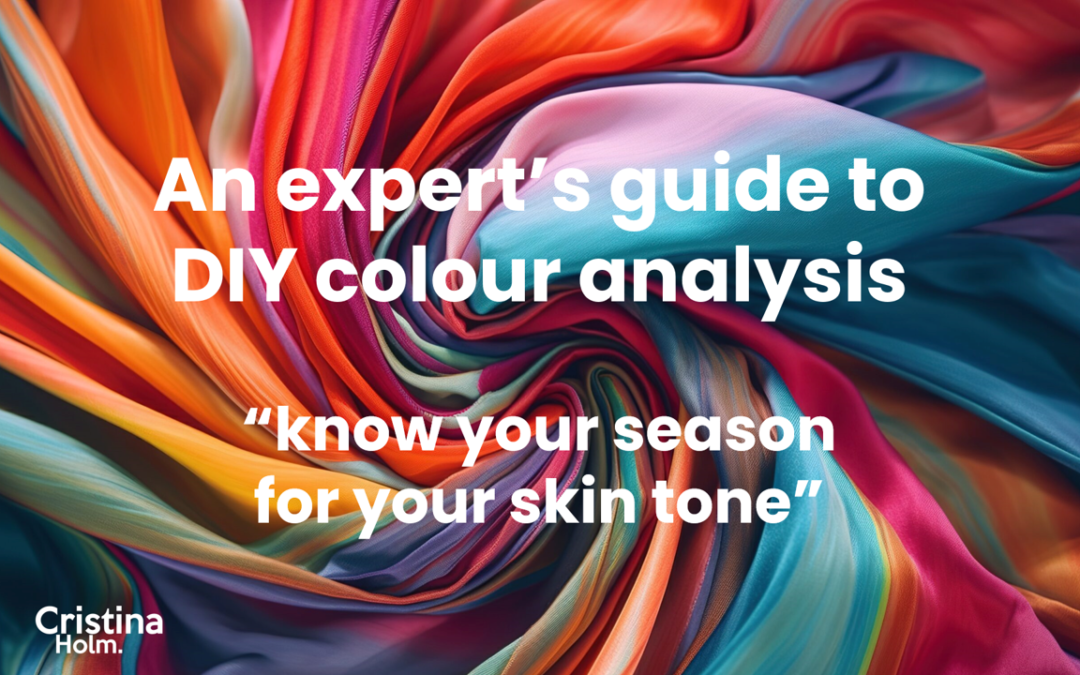
A ‘DIY’ guide to colour analysis. Know your season.
Leading Personal Stylist and Colour Consultant, Cristina Holm explains how…
DIY Colour Analysis
I have met plenty of customers who have tried to work out their colour palette all on their own, to varying levels of success. It’s a worthwhile investment to visit a specialist, however I know that’s not always possible. So here are my tips for those on a tighter budget to help you ‘do it yourself’ and hopefully, accurately.
Now, the best way to approach your analysis is to understand the tonal system. Let me explain…
Are you Warm or Cool?
The quickest and most accurate way to determine this answer is the ‘gold / silver’ test.
If you are more suited to gold, you look better with other warm tones. If you are cool, then silver will complement you better.
To do this properly, you need four fabrics, similar to the four drapes in the picture:
– A bright gold
– A bright silver
– An antique gold
– An antique silver
A local haberdashery can perhaps help to source these. 40 cms square is all you need for each.
Then you go through the process of holding up each fabric below your face (from mid neck) to see which metal brightens your face.
Importantly, don’t wear any foundation and do this all in natural light. If you don’t, you’re highly likely to get it wrong! I also recommend you avoid doing your analysis when your skin is sunkissed and tanned, as this also makes your comparison far less clear.
Look at your eyes – if they stay bright and clear and you have no dark or redness or dark lines standing out beneath, then you have found your preferred metal. I repeat, just make sure this is all done in natural light, to avoid making error.
In terms of the seasonal system, if you are warm, you’re either a Spring or Autumn. If you are cool you’re either a Summer or Winter.
How great is that? Now you’re already halfway there!
“Follow the ‘gold / silver’ test. You need four fabrics – a bright gold, a bright silver, an antique gold and an antique silver. A local haberdashery can help.”

Now, are you Light, Deep, Soft or Bright?
Okay, let’s get back to the tonal system. Beyond being warm or cool, your skin type will also be light, deep, soft or bright.
This is the tricky part of your DIY analysis as you really benefit from having the necessary colour drapes to pinpoint this with accuracy.
The relevant colour drapes to do this properly range in price from between £275 to £700. This alone is why visiting a stylist, who has not only been professionally trained, but has also invested in these drapes, saving you money, as you don’t have to.
The two gold and two silver fabrics can assist to some degree, as two are brighter & lighter and the other two more antique like shades, which are softer & deeper. However, be warned, your personal preference can often bias what you see.
I also provide the current season’s colour trends by seasonal palette to help when you’re out shopping in stores. Here are the links:
Seasonal palettes for Autumn / Winter 2025
Turning tones to seasons
If you’re cool and light, you’re a Summer.
If you’re cool and deep, you’re a Winter.
If you’re cool and bright, you’re a Winter.
If you’re cool and soft, you’re a Summer.
If you’re warm and light, you’re a Spring.
If you’re warm and deep, you’re an Autumn.
If you’re warm and bright, you’re a Spring.
If you’re warm and soft, you’re an Autumn.
The best swatches are Seasonal ones
I know a lot of women still get confused and that’s why having your own palette swatch is really helpful when you physically shop and a smart investment.
I’ve compared both tonal and seasonal swatches over the last 15 years and recommend the latter. The seasonal swatches are clearer, especially if your consultant identifies the best ones. I call these “100%-ers” as they suit you even at your palest. The rest are “75%-ers” which are all good for you, just not as good as your best.
The trick is to always refer to your swatch and if you religiously stick to these shades (or as close as), you’ll never go wrong.
“The most common error is buying an item of clothing that isn’t in your colour palette.”
The most common error
Is buying an item of clothing that isn’t in your palette. So why is that such a problem?
Well, it’s twofold. First of all, it won’t easily match with any of your other garments that are in your palette. Secondly, you’re then tempted to find new clothes in colours that do match this item and unfortunately two wrongs don’t make a right!
You CAN break the rules (BUT only by following more rules)
Black really only complements a Winter. However, you can still wear black even if it doesn’t suit you. The trick is to wear an accessory that is one of your best colour tones near to your face – like a necklace, scarf or pashmina.
I know some ladies prefer gold even though they are cool. In this instance, the best technique is to choose the better of the two golds. So, if you’re bright wear bright gold and if soft tones are best on you, go for antique gold.
Similarly, when your bottom half involves wearing a short skirt or shorts and your skin is on display, you should stick to the rules and buy colours within your palette. However, if you’re wearing long trousers or a full length skirt (or any skirt when worn with tights), you don’t need to fuss over the colour of your bottoms.
More colour related blogs to come
Once you know the colour tones right for you, the next step is to focus on choosing the right colour combinations. For more information on how to do this, look out for my next blog within my colour series.
I’m writing about colour combos soon and this will also include consideration for your body shape and proportions.
One day in the future…
Brands and retailers will be smarter and tell you which colours complement a season or tonal skin type. A few brands, like Kettlewell already do. However the majority of brands are too generic with their online colour descriptions – which I find frustrating on your behalf.
This is why I am working on a new clever technology within My Secret Stylist to fix this for you. That’s because I know that as soon as you understand what suits you, you’d appreciate my help to find the right colours! Not just in the right colours but also in the styles which complement your shape.
In the meantime, I hope my explanation of the tonal system and seasonal palettes is of assistance, particularly if you want to try your colour analysis for yourself.
Of course, I do recommend you see a specialist like me, for assurance and accuracy. I have all the relevant drapes and the right swatch booklet for you to take away, plus you also get a make-up palette as part of my service, so you forever have a guide to refer to in years to come.
Speaking of which, every season I update the latest colour tones that are on trend. Once you know your season, you can use it when out shopping (and it’s really helpful in case you forget your swatches). See the link in the section below.
I hope my blog has been of assistance. By all means share with others.

Read more in this category

Accessories for your Spring / Summer capsule wardrobe
Key Accessories for your Spring / Summer wardrobeHere is my checklist for what accessories you need for your Work, Rest and Play capsules during the...
Be colour beautiful
The colours you wear can transform not only how you look… but how you feel emotionally Plus, they can change how others perceive your personality...

See which ‘fashion trend’ colours suit you best for Spring & Summer 2026
What are my best colours for the new fashion season? (Spring Summer 2026) See which colours will dramatically transform how you feel. Find YOUR...
UK Fashion – Your Seasonal COLOUR swatches for Spring & Summer 2026
UK Fashion Trends. Seasonal colour swatches for Spring & Summer 2026. See which colour tones are best for your natural complexion. By Cristina...

Which hairstyle suits your face shape?
Which hairstyle best suits your face shape? Here's how to find out your face shape plus some inspiration for your next hair cut. As an image...

Autumn Winter – Work, Rest & Play capsules for your wardrobe
Key staples for your Autumn / Winter wardrobe This is my go to checklist for creating capsules for your Work, Rest and Play lifestyle during the...

Cristina Holm
Cristina Holm is one of the UK’s leading personal stylists. Cristina is based and operates from her studio in Warfield, Berkshire (United Kingdom). She serves clients locally and internationally.
Cristina is also the founder of My Secret Stylist, the UK’s best kept clothes shopping secret. For only £35.99 per year, you can find and ‘see in seconds’ clothes which complement your body shape across all the popular brands. For more information, go to www.mysecretstylist.co.uk